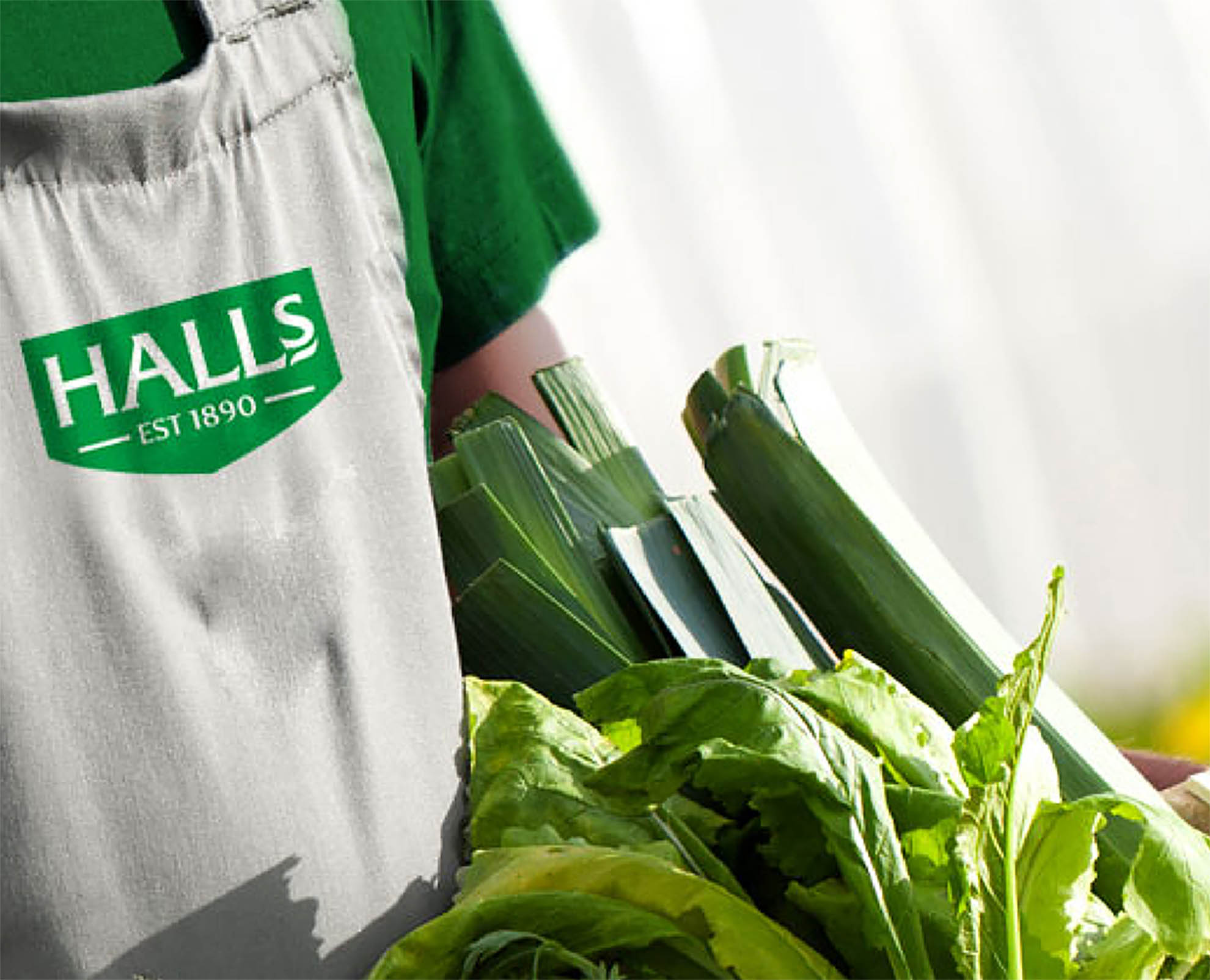


It is always difficult to rebrand organisations with history. Their brands are entrenched with equity that have been built over much time. But how do you balance equity with relevance – you cannot forego one for the other. And cannot remain “stayed” in a fast-changing market. We needed to remember that this iconic brand celebrated their 125th year of business in 2015 and has become a global symbol.
Their vision was to rebrand into a fresh, contemporary look and this needed to be done with all the necessary due consideration given to their past.
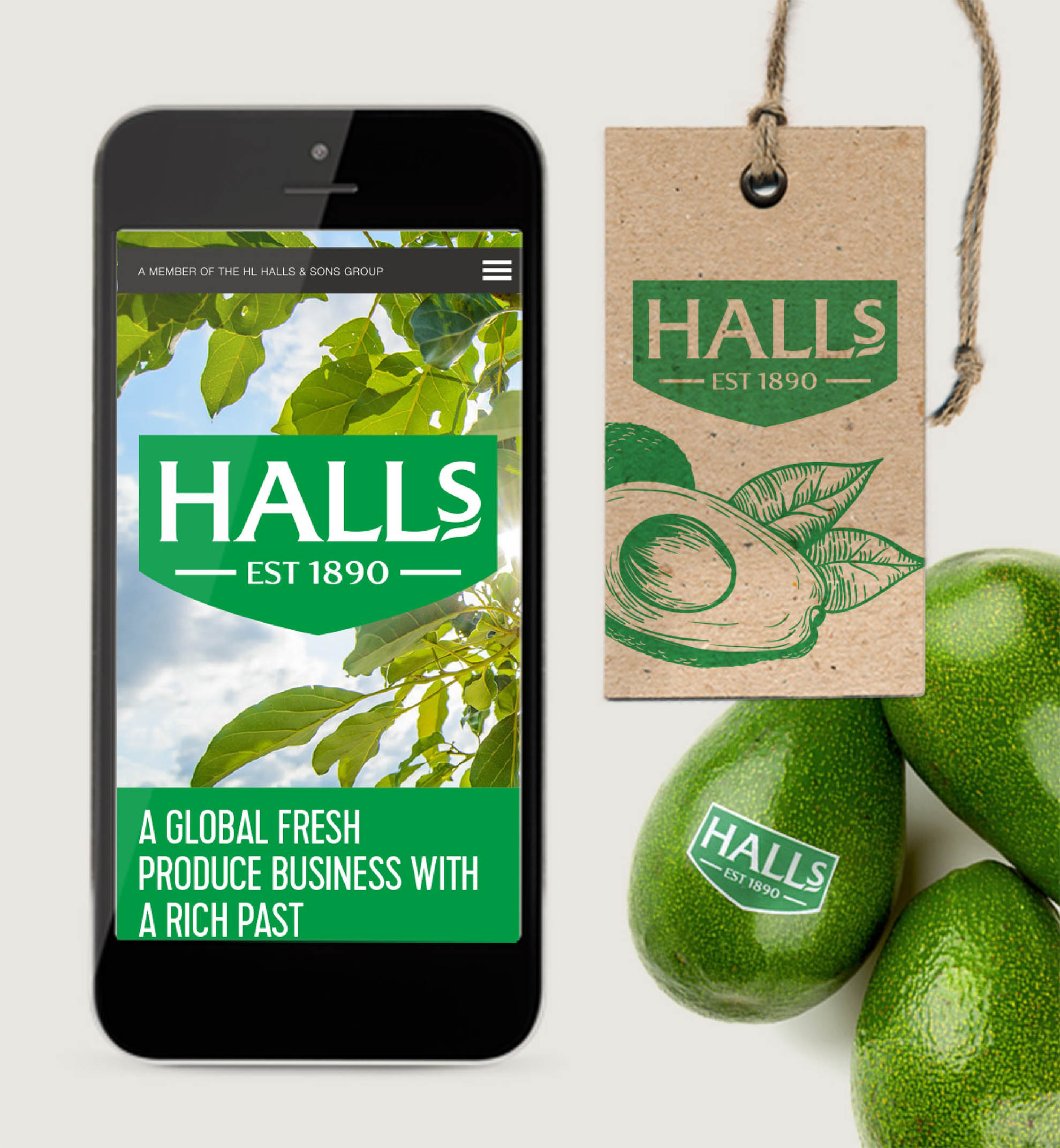
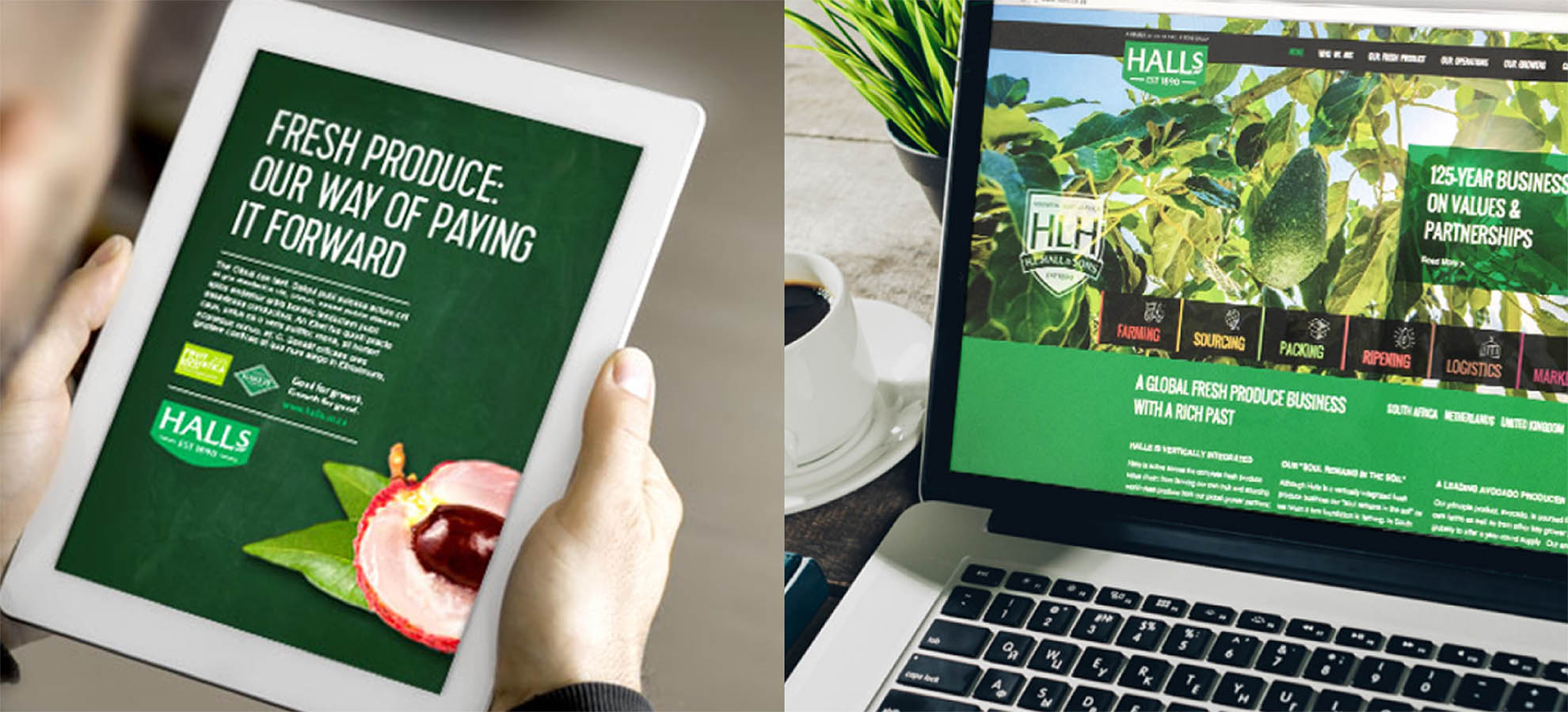
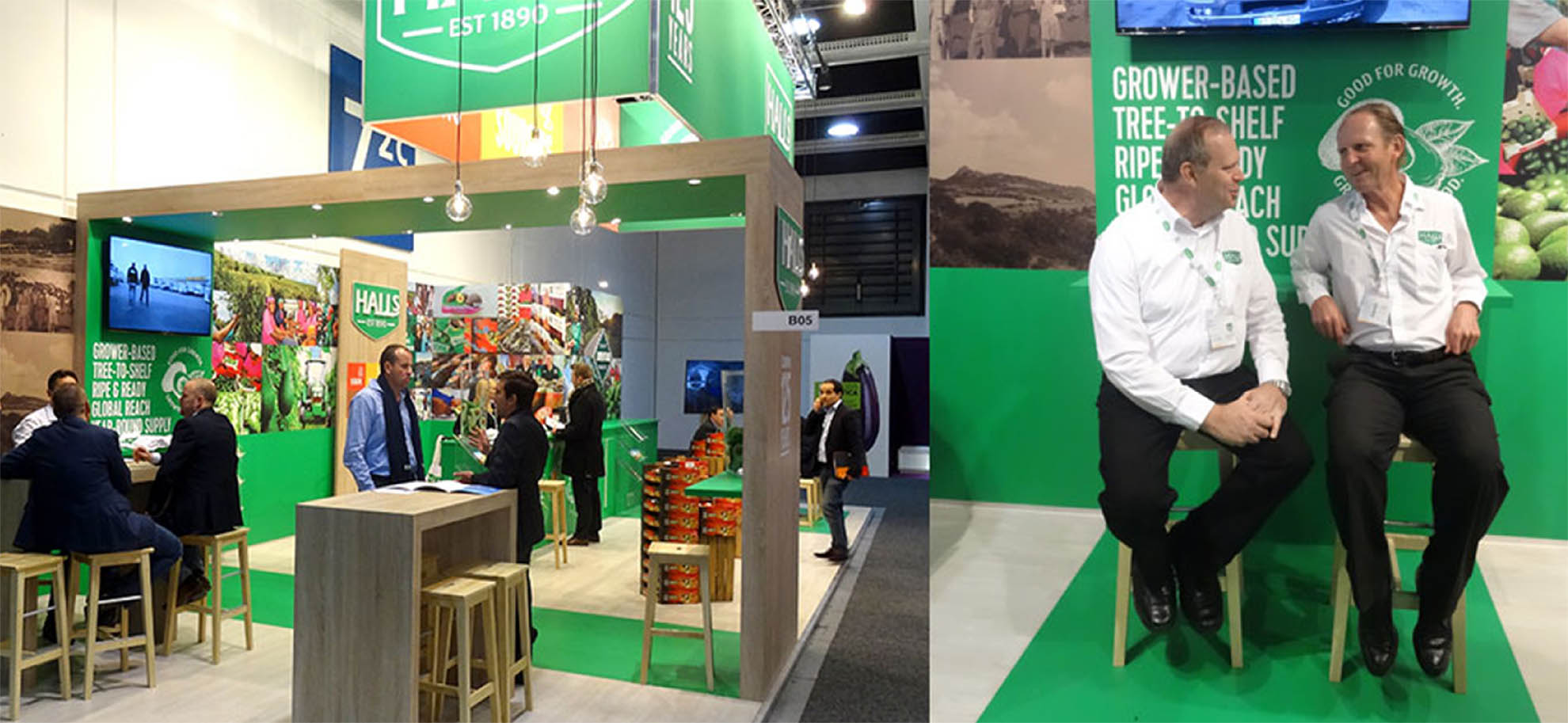
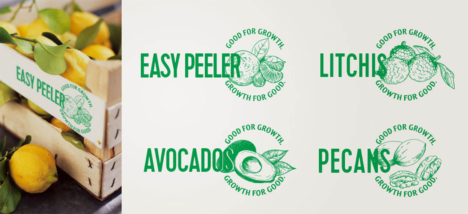
This rebranding included:
– Brand architecture across 3 pillars of business as well as the holding company
– Packaging across 12 SKU’s both for export and local produce
– Digital and print advertising
– Local and international signage
– Vehicle livery branding
– International exhibition stand design
– Print collateral like brochures, stationery and internal templates