Refresh a management app UX for the food industry
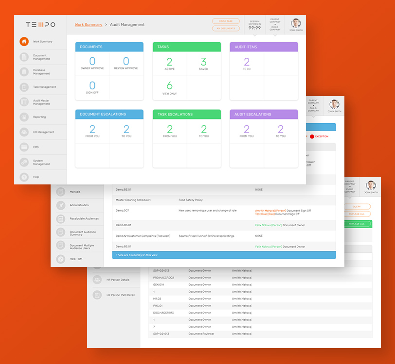
At PlusNarrative, our designers pride themselves on their ability to embody the digital equivalent of a displaying peacock. So what emerges when we are approached by a client who requires a refresh of a complex integrated management system with no images and little colour? A challenge, that’s what.
We approached Tempo with the view that even stats and task-based apps can be beautiful. By deploying subtle shades of grey, ethereal shadows and splashes of pastel colour, we crafted a user experience which prioritised the clear display of information above all else.
Even stats and task-based apps can be made beautiful.
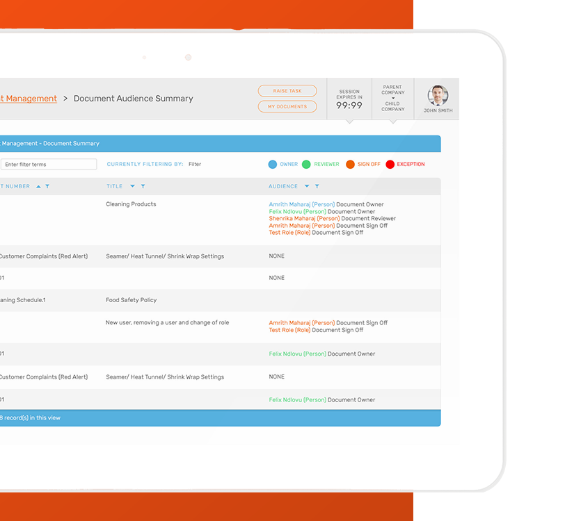
The result? The user is able to maintain an understanding of their relative location at all times by following subtle, strategically placed touches of colour as they navigate through the application, especially when four levels deep.
Challenge: defeated.