
ABOUT THE WORK
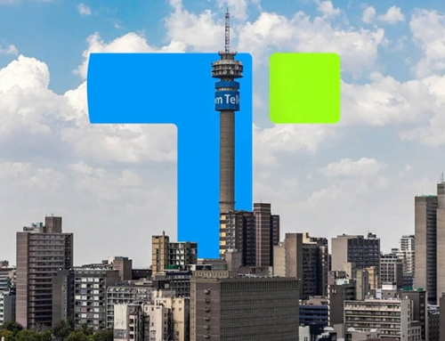
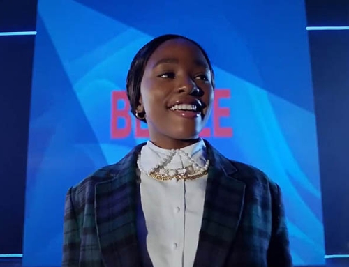
We needed to signal a new Telkom, one that reasserts its relevance in modern South Africa in a fast-moving, digitally enabled, culturally dynamic market. We wanted to ensure that we can evolve without abandoning the equity of a trusted national brand. The brand identity refresh featured a logo change, evolving the current wordmark into a bolder, more considered logo, with the “T” becoming dynamic to future-proof the brand for a time when simply utilising the “T” with the pop of green will be recognised as Telkom!
The iconic blue was reimagined into a lighter, more human blue, a new font was introduced to celebrate the dynamism and bold intentions, new icons were created – a “functional set” for digital use, drawing inspiration from the geometry of a SIM card, a “feature set” is expressive and dynamic used to activate layouts, enrich typography, and bring a sense of possibility to our visual language.
Our new sound? We’ve turned our dial-string into our mnemonic for our brand soundtrack. Built on the rhythm and cadence of our USSD, our sonic branding brings the familiarity of our iconic “Molo Mhlobo Wam” greeting, movement, and meaning to every touchpoint, helping our brand not just show up but be heard.
CREDITS
Client/Brand: Telkom
Agency: BlackSwan
Chief Creative Officer: Thembalethu Msibi
Chief Design Director: SJ Naude & Shelley Atkinson
Creative Director: Thulani Mathebula, Monde Lobola
Chief Strategy Officer: Wandile Collis
Senior Designer: Zeb Chuenyane, Tammy McCridle
Designer: Kalyn Botha
*If your company collaborated on this project and you’re not featured, please contact studio@ididthat.co and we’ll help you become a member.