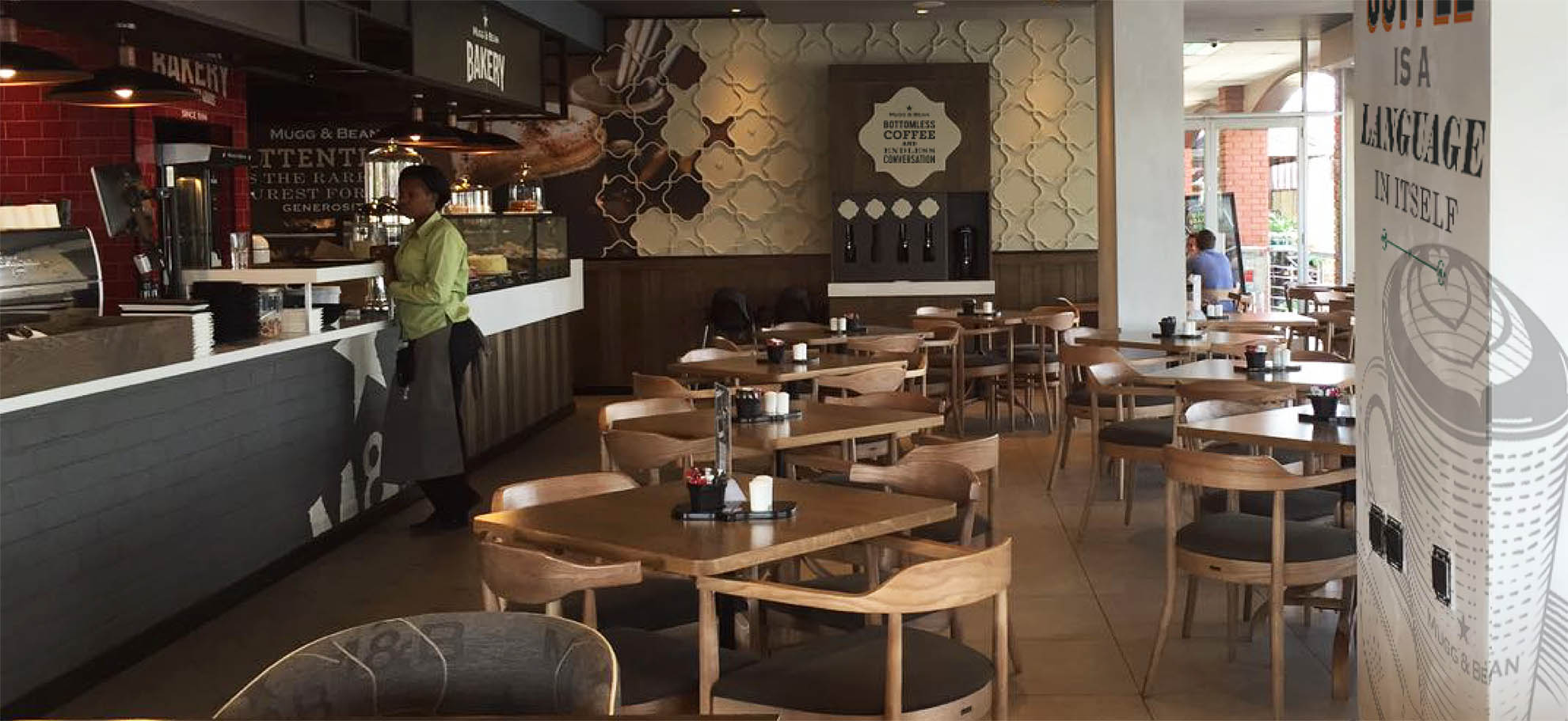
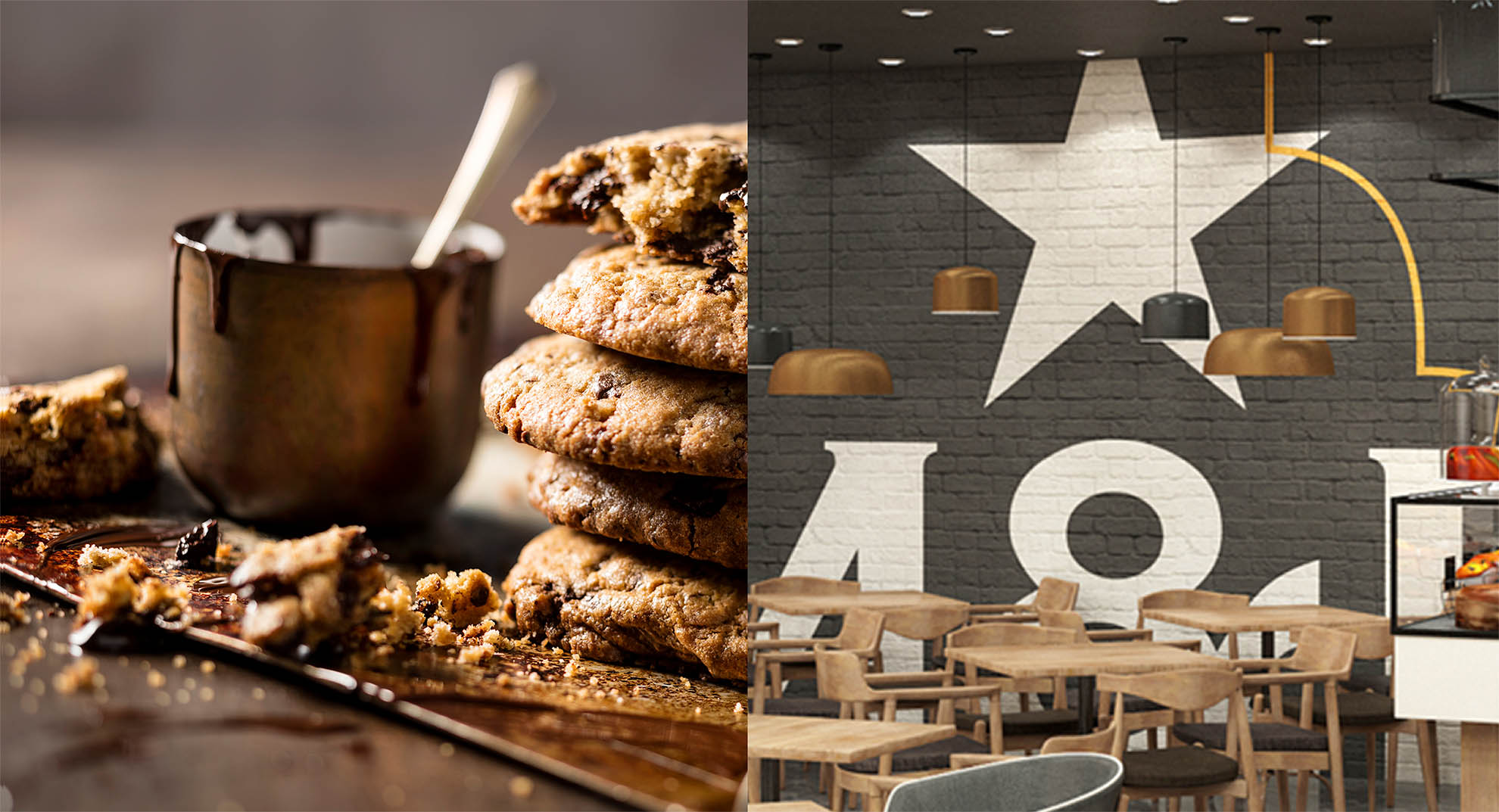
Brandrenew was tasked with pushing the current M&B brand as it was felt the brand needed modernising without losing the authenticity of its early years. The strategy of “Welcomed Generosity” had to be amplified throughout the store spaces.
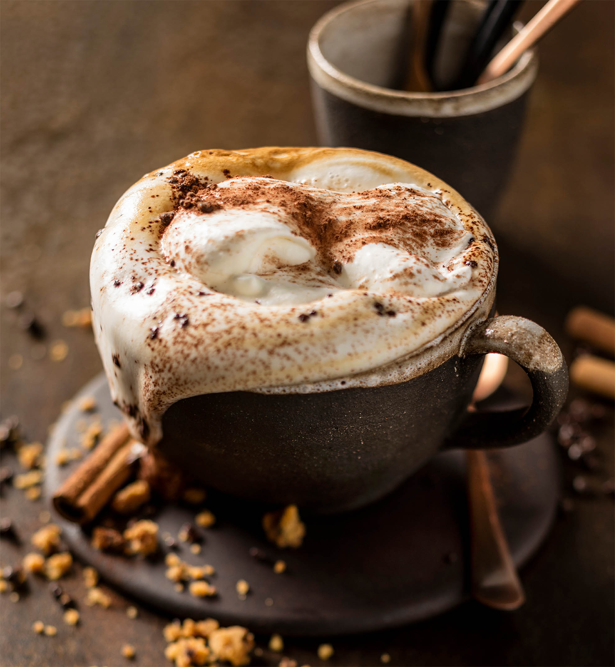
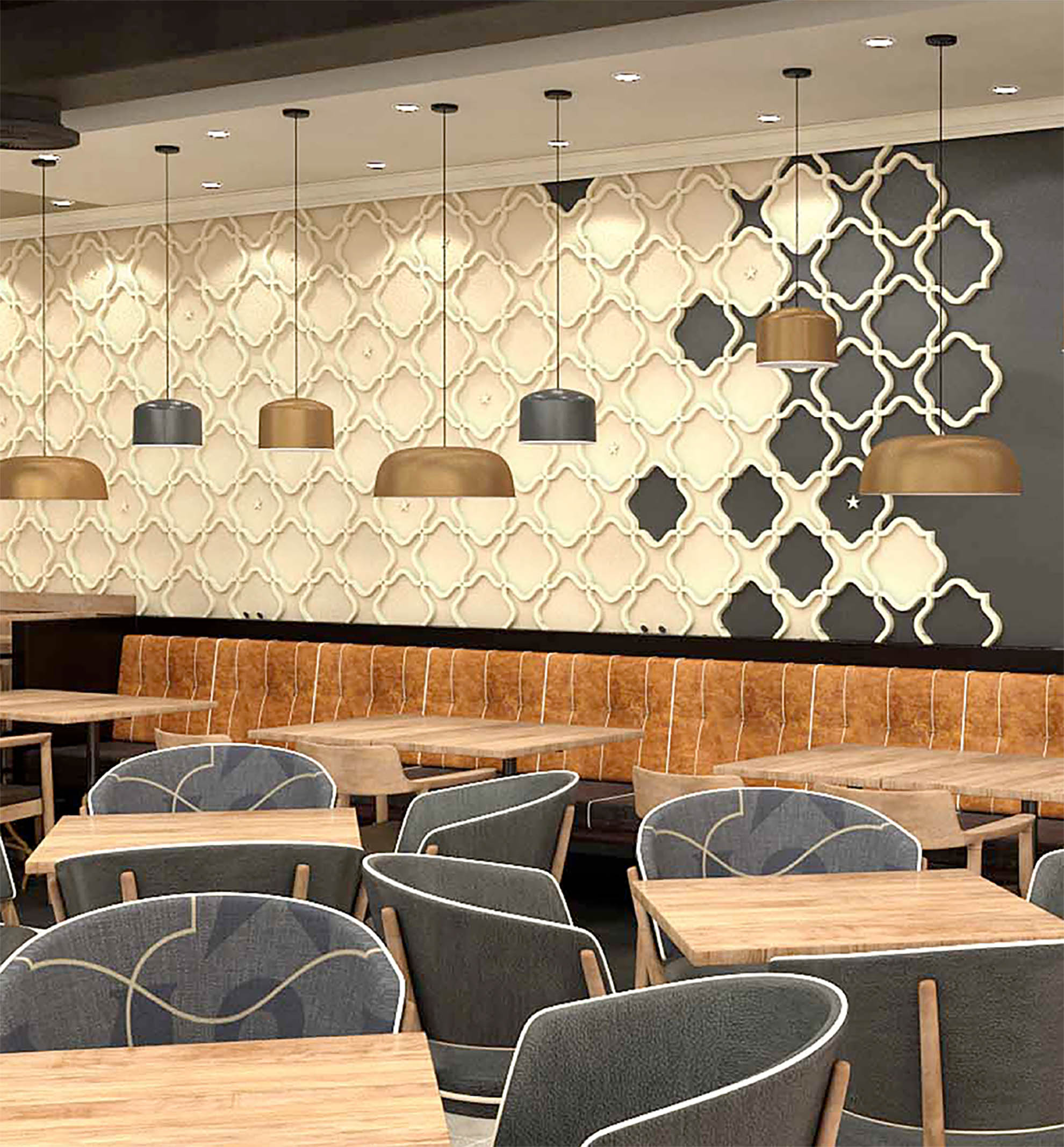
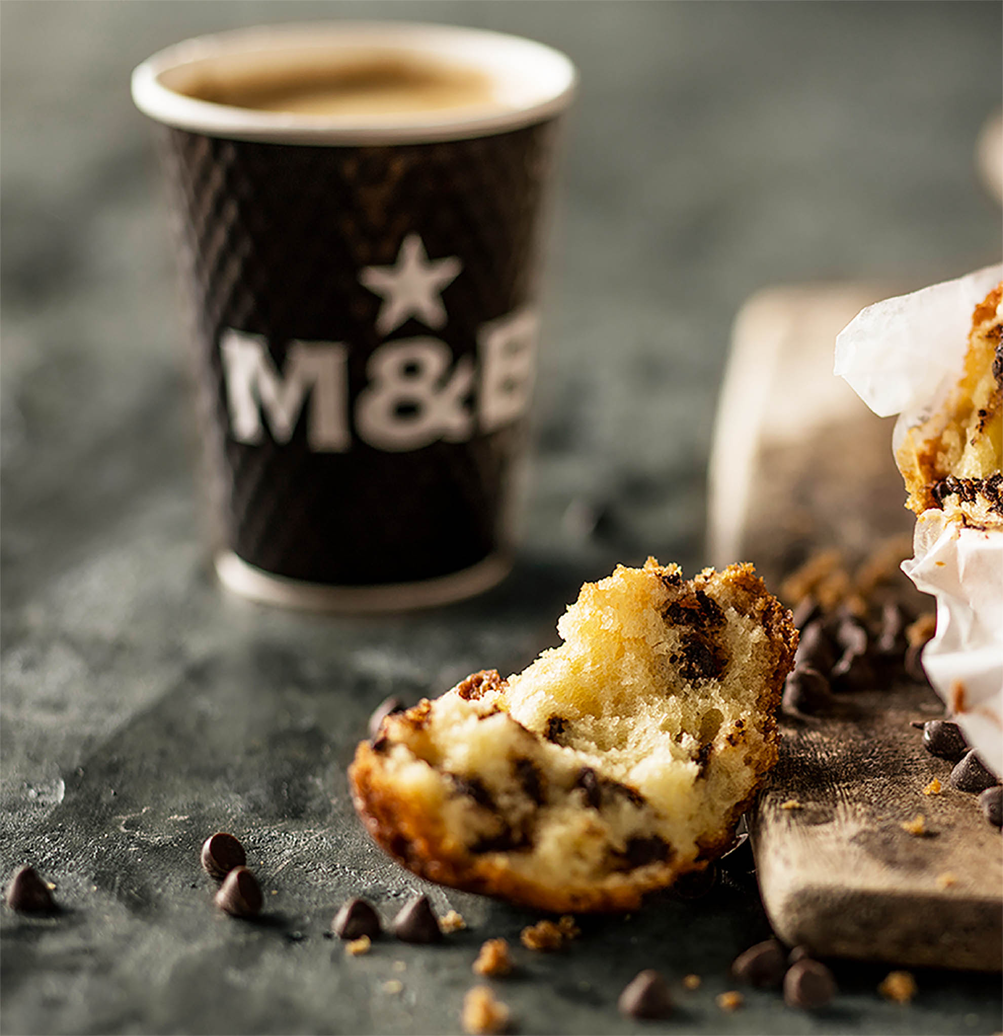
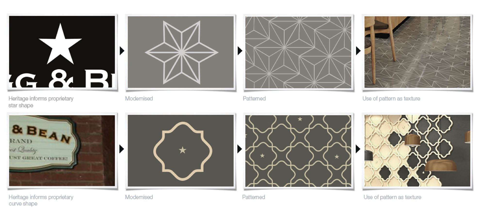
The initial insight was to go back into the brands history and resurrect and modernise old design elements that still hold equity. Overall, the result is a cohesive toolkit of iconography, colour, vintage graphics, proprietary patterns, typography, and photography combined to create a refreshed contemporary visual space that remains relevant yet still retains the heritage of the Mugg & Bean Brand.


