Project Description
The Brief
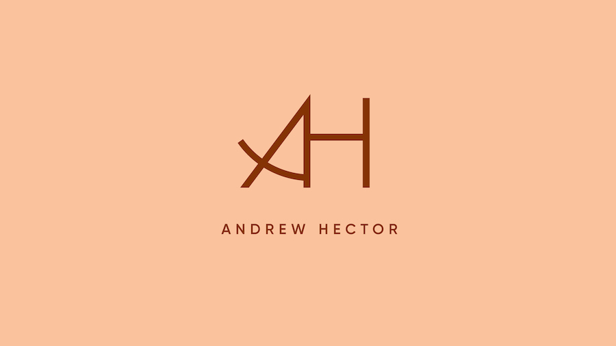
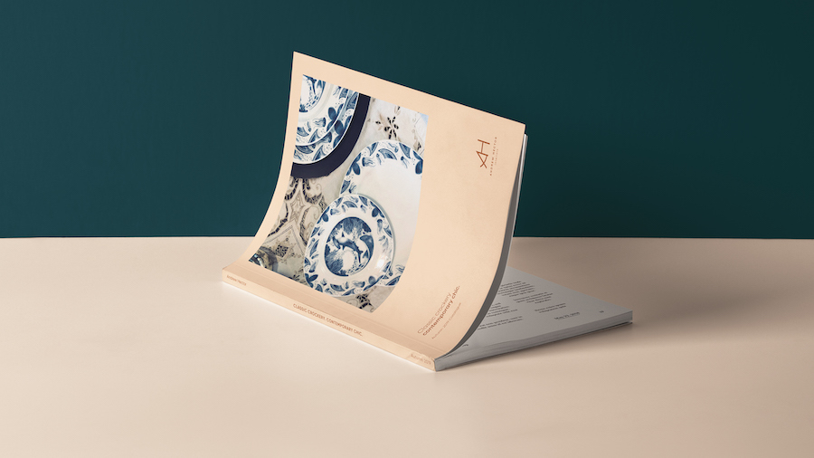
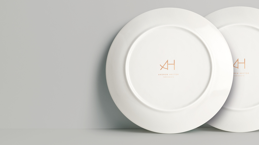
Andrew Hector is a design agency that specialises in interior and tableware design. Following the introduction of their new tableware range, the agency decided it was time for a rebrand that would encompass their personality and strive for excellence.
The Creative Solution
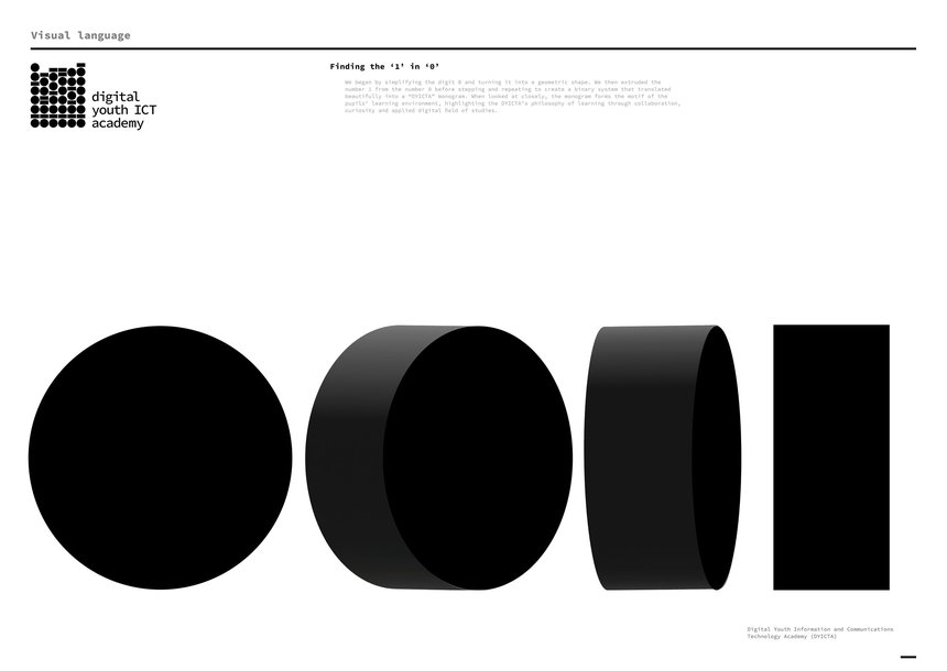
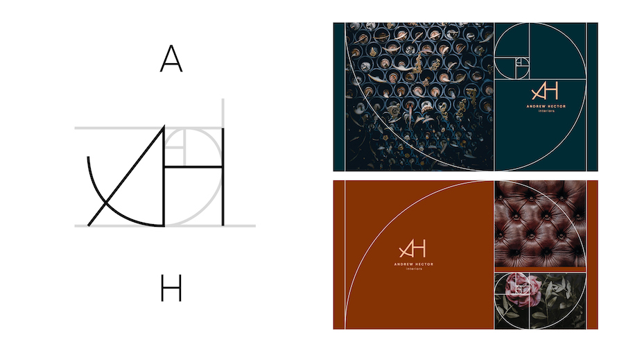
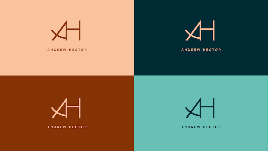
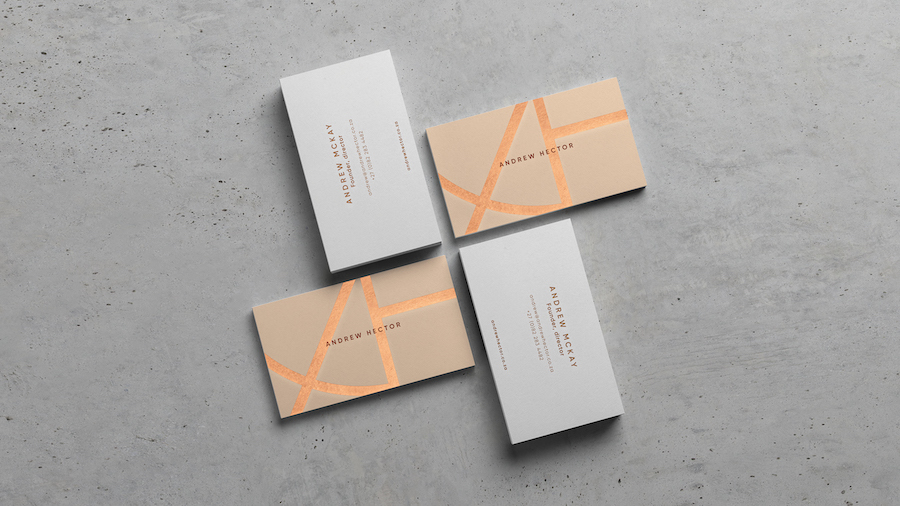
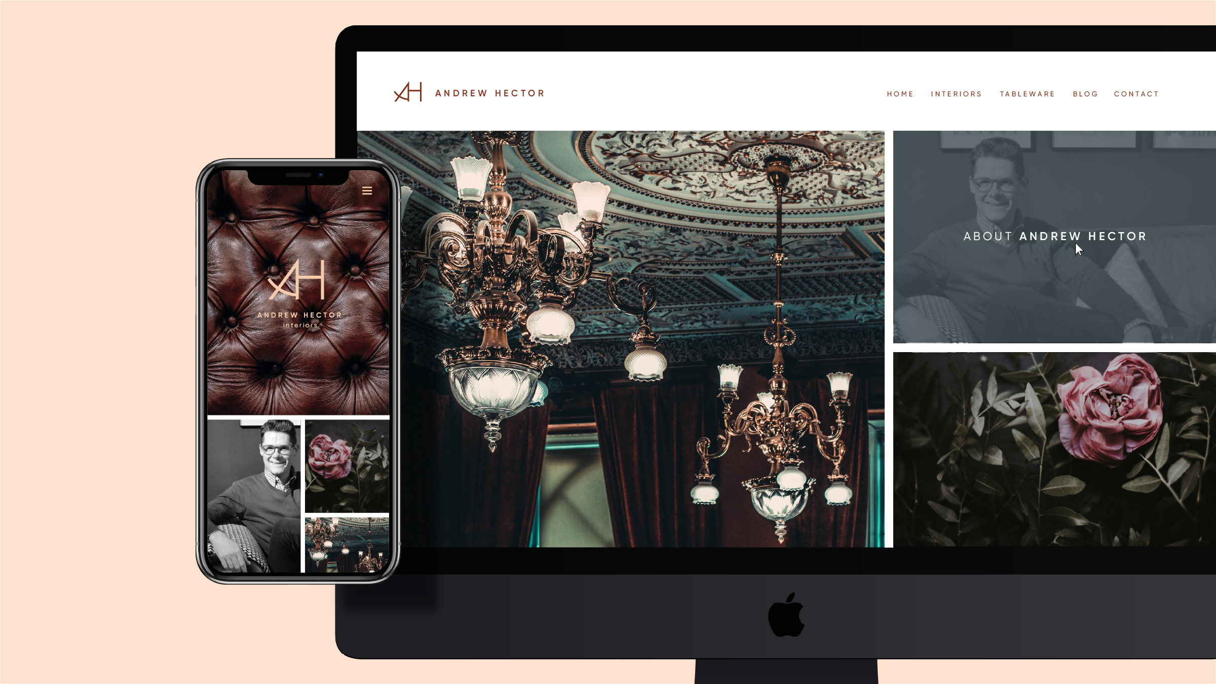
Using the golden mean as a point of departure, a monogram was created to grant the brand an air of gravitas. The same principle also forms the basis of the visual language, and the brandmark is applied as a dynamically cropped element throughout, creating frames, shapes and graphics that can grow and shrink dependent on the application.
Though the brand aims to market internationally, they still wanted to reflect their African roots. As such, inspiration for the colour palette was drawn from the main themes behind the brand’s tableware, namely the African Savannah and the African coast.


