

Project Description
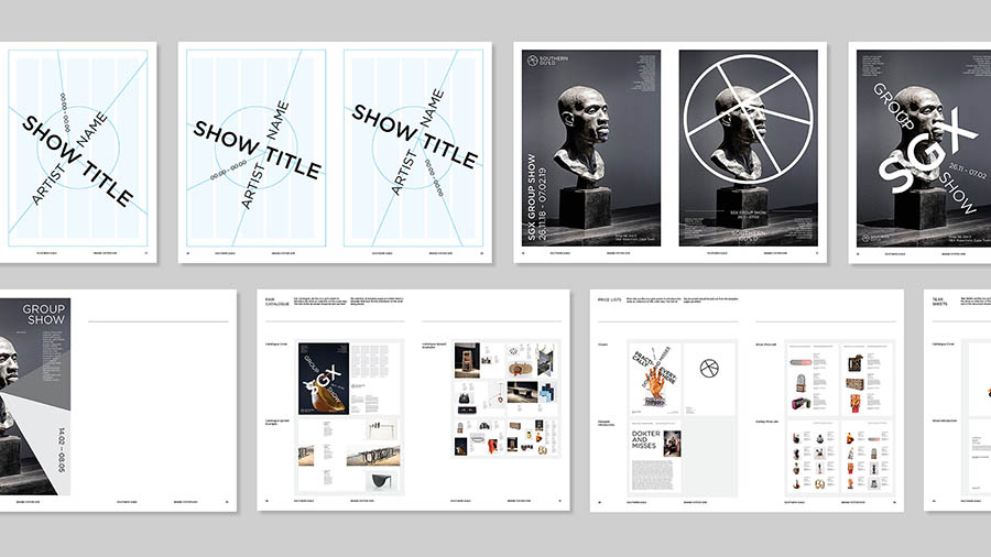
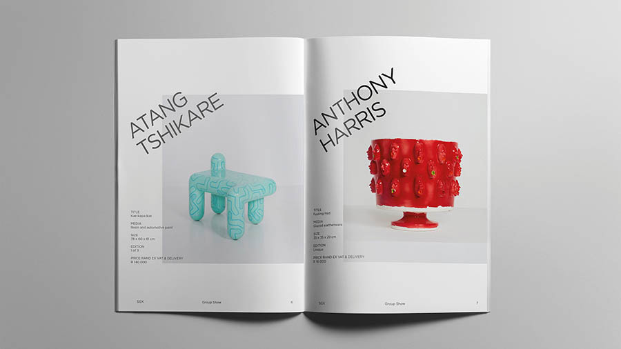
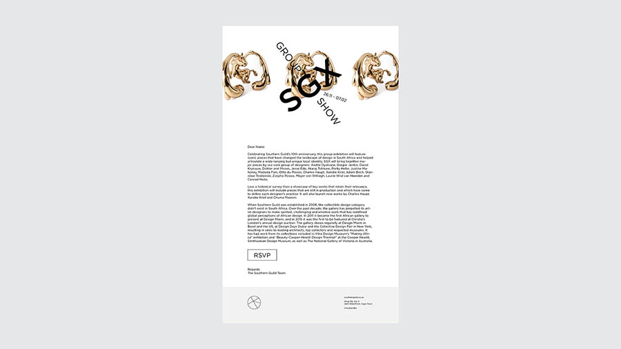
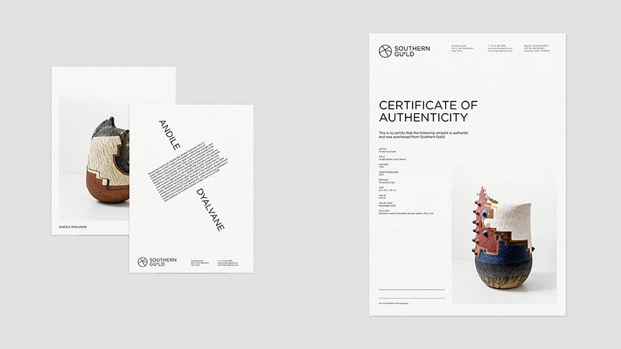
Our task was not to redesign The Southern Guild identity but to evolve it into a fully-fledged Brand System. If the nature of The Southern Guild is to represent design in Africa, how, then, could we design a brand that was distinctive and recognisable in its own right, but also understated in order to allow the work of its artists to take centre stage?
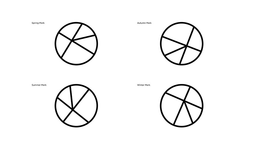
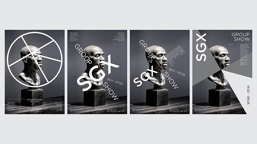
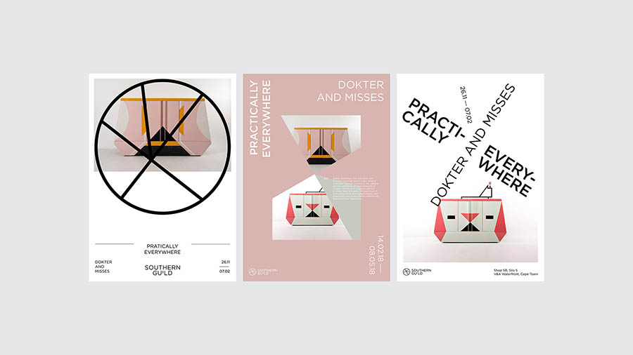
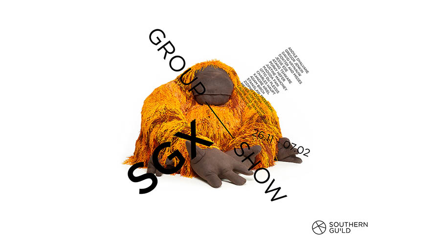
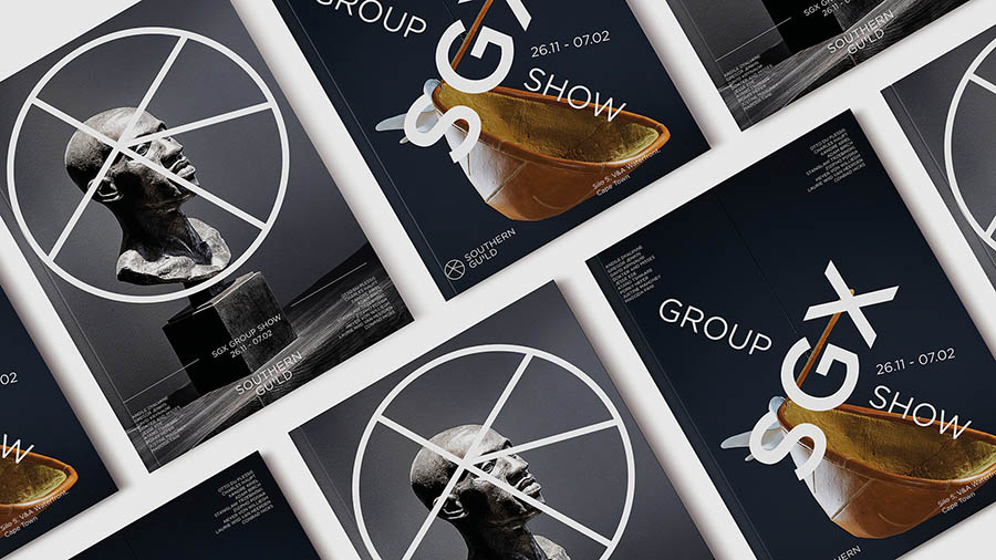
As a business model, The Southern Guild is undeniably calendar-based. The resulting Brand System is based on the shape and formation of the Crux Constellation, also known as ‘The Southern Cross’.
The iconic formation of stars has been used throughout the centuries as a navigation tool and a wayfinder, the voyager’s most reliant assistant. Its position in the night sky has been fundamental in signalling the change of seasons, the harvest and the rainfall.
With this in mind, the creative direction of The Southern Guild brand evolution began by isolating their original logomark and emphasising its boldness as a stand-alone graphic element. By exploring the different applications of the cross—based on its incremental movement through the heavens—a dynamic system was born: a twistable, rotating system relevant to the time of year it is used. This simple yet audacious design was interpreted and developed into a grid system, solidifying a completely adaptable and distinct brand identity.


